Even though I was very happy with the Ocean Mist design that I used for this blog, until now, I was not very happy with the readability of it. That’s why I made some changes, hopefully for the better.
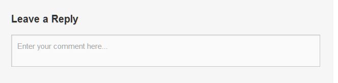
The font is slightly bigger, as well as the space for the comments.
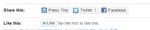
New is also that you have to open the post (either on clicking on the title, or on the bubble on the top right) to make a comment, or to like and share it. That’s a bit unfortunate, but I think not that significant in the long run.
I hope you will enjoy the bigger pictures as well.
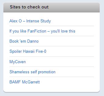
And last but not least you can find Links on the right. Check them out if you like.
Let me know what you think of the slight overhaul.
